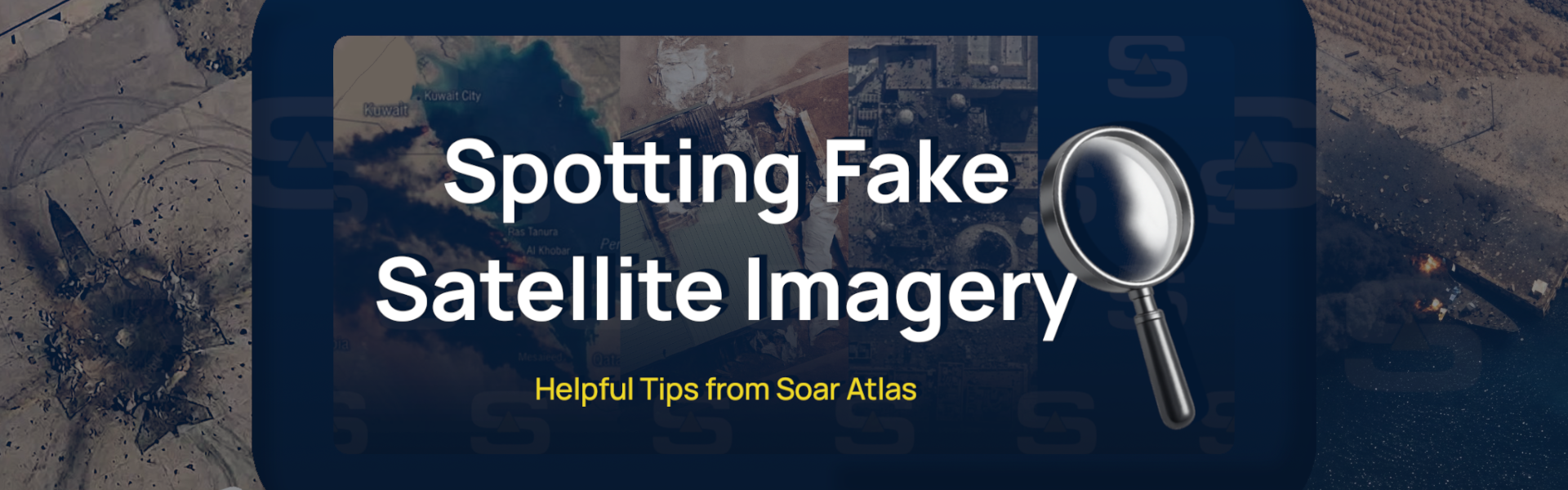

The situation in the Middle East is changing fast, and with the rise of generative AI, it’s becoming increasingly difficult to know what’s real online. One area where this is especially evident is satellite imagery. Our goal is to be a neutral, trusted platform that everyone can rely on for accurate information. Lets explore some important ways to look out for fake and AI generated satellite imagery.

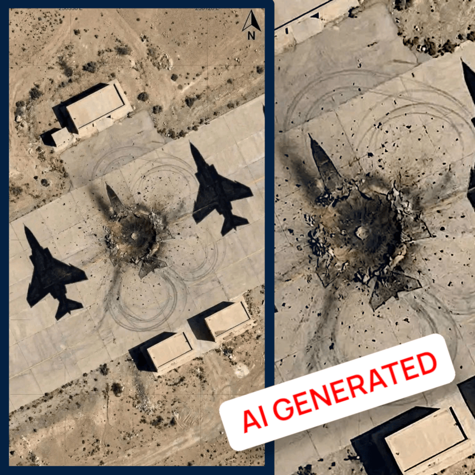
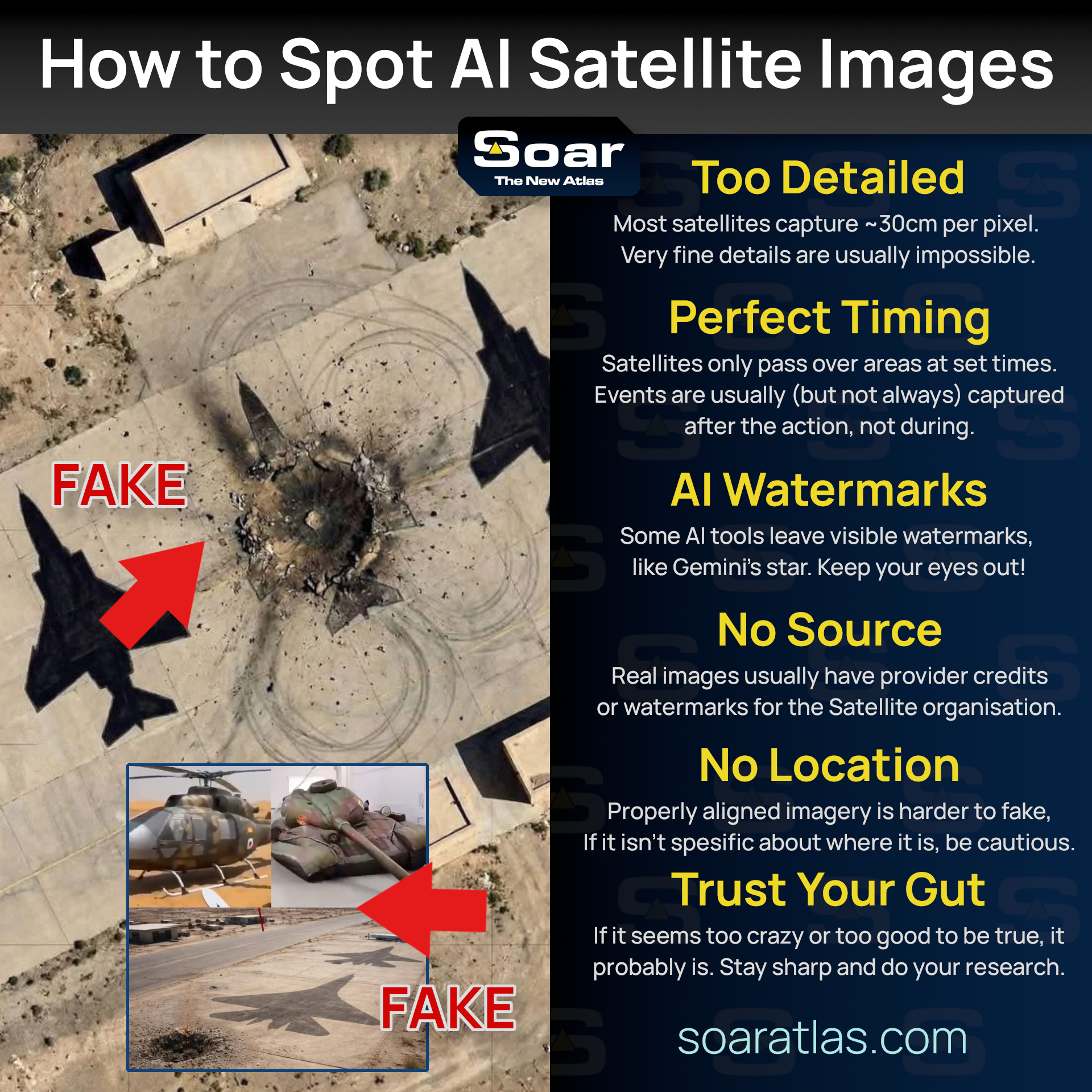
A post went viral recently claiming that decoy plane silhouettes had been painted on the ground to trick military forces into hitting fake targets. This isn’t true, the accompanying image was AI-generated. So, how can we spot fakes like this and separate fact from fiction? Look out for these signs!
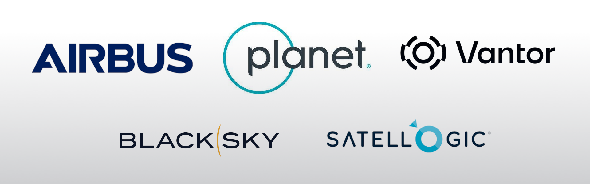
Manufacturing satellites is a complex task, moreover capturing and delivering imagery is often expensive, and in some cases highly regulated. If high-resolution imagery is released, it’ll always have some kind of source. Look for attribution text such as Airbus, Planet, or Vantor, which are some of the world’s leading providers (usually, these images also come with watermarks). If there is no original imagery source, be cautious.
On Soar, we require all attributions to be included in the description or imagery itself.
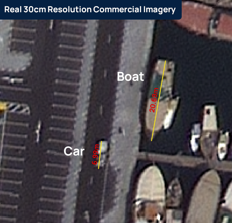
Most commercial satellite imagery simply isn’t as detailed as fakes. Yes, high-resolution satellite imagery exists, but you’re usually limited to around 30cm per pixel for major providers. This means for every pixel you see, you can measure 30cm on the ground. This is great for wider detail, but very fine details, like rubble, wouldn’t be as sharp. Free satellite imagery is even lower in detail, usually around 10 meters per pixel. This is great for viewing wider areas of interest but you cant exactly zoom in to see cars, tanks or in most cases homes and buildings.
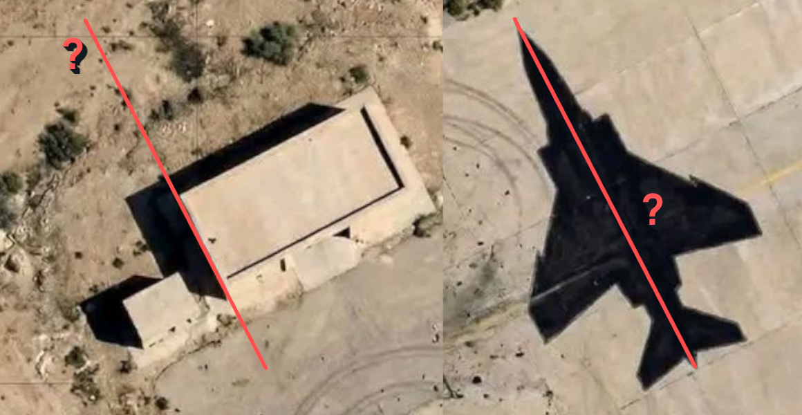
Scale is important too! We’ve seen several images that distort it. In the example above it looks like the F-4 Phantom is bigger than the building! (In real life the F-4 is 19m long). Many AI-generated or fake satellite images have this same issue, exaggerating or misrepresenting scale when creating content from scratch.
Try to understand how satellites work. They orbit the Earth, so capturing and releasing an image can take days or even weeks depending on the location. Sometimes people want imagery over an area, but smoke or cloud obscures the view. If an event looks a bit too perfectly timed, too cloud free, or too clear, be skeptical.
Satellites aren’t magical live cameras like many movies depict. They have real limitations, including resolution, coverage area, and cloud interference. (Note: Unless you have access to the KH series of classified US military satellites 😉. More on that next time but here is link to Harry Strangers images on Soar which show declassified satellite imagery from before the 1980s).
Georeferencing is the process of placing an image over its real-world coordinates, useful for knowing where it sits on Earth and perfect for comparing before and after. On Soar, most maps are georeferenced. Generally, if a map is faked, it’ll be much harder to georeference as details won’t line up with the real world.
However, sometimes an image shows a real satellite image, but AI tools have been used to manipulate it, adding detail or enhancing it in ways that aren’t fully truthful.
Take, for example, an image submitted to Soar uploaded by a community member. The black and white original was a real, verified satellite image by Vantor. However, the version uploaded by the user had been AI-upscaled and colorized, and the original Vantor watermark had been removed and replaced with a MizarVision watermark instead.
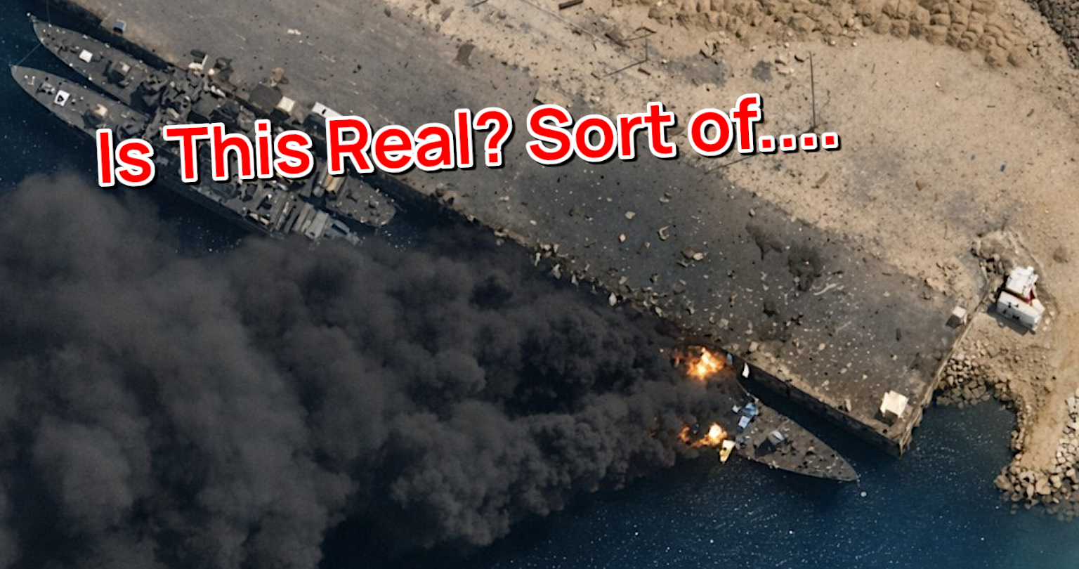
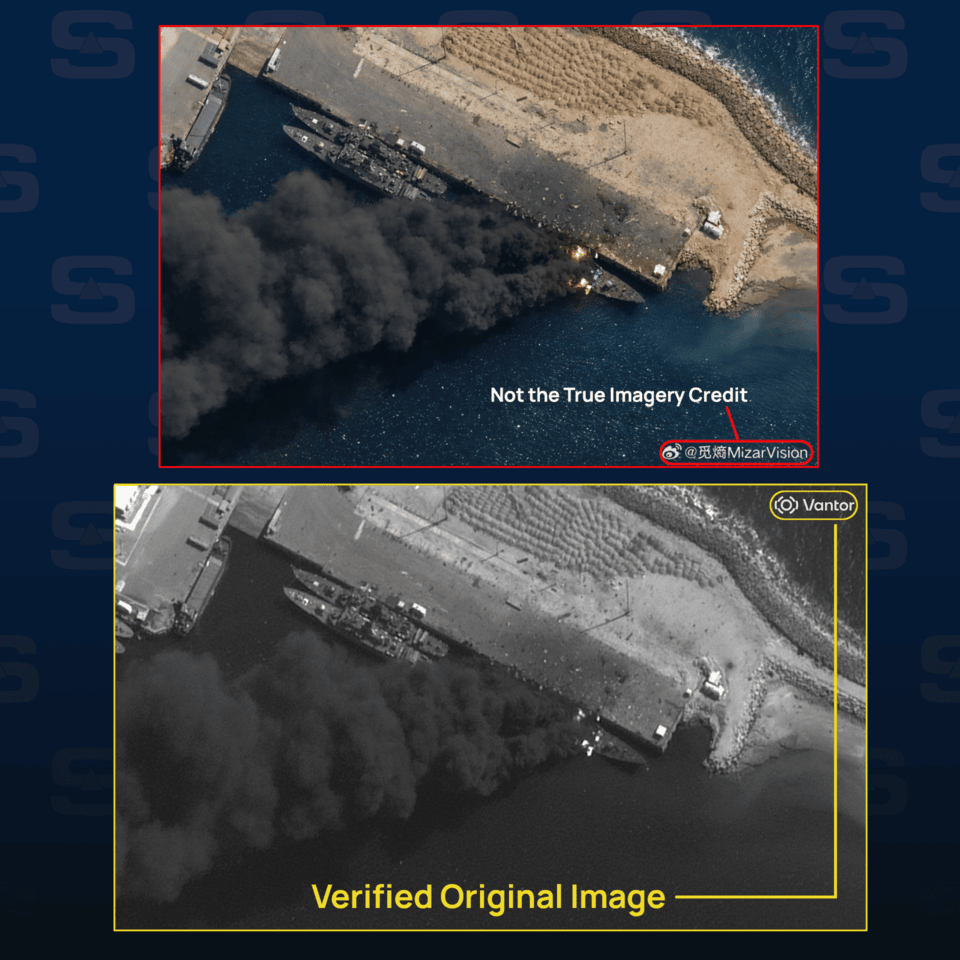
In this case, what you see is based on reality, but the finer details and clarity are not. This is where things get complex. Do we call this imagery fake? It’s been enhanced with tools to give a clearer view of the situation. This can be useful for investigators and isn’t too different from standard satellite processing like contrast and colour adjustment. But the lines blur when the enhancements start to distort what the real satellite image actually shows.
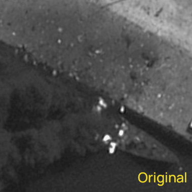
AI essentially “guesses” details, and that can exclude or alter important information. In the original image, the rubble near the explosion is clearly lower resolution, and haze from smoke and atmospheric conditions are visible. In the AI-enhanced version, these details are sharpened or missing, and the fire on the ship is exaggerated. These little details matter and if misused, they can distort the reality of a situation.
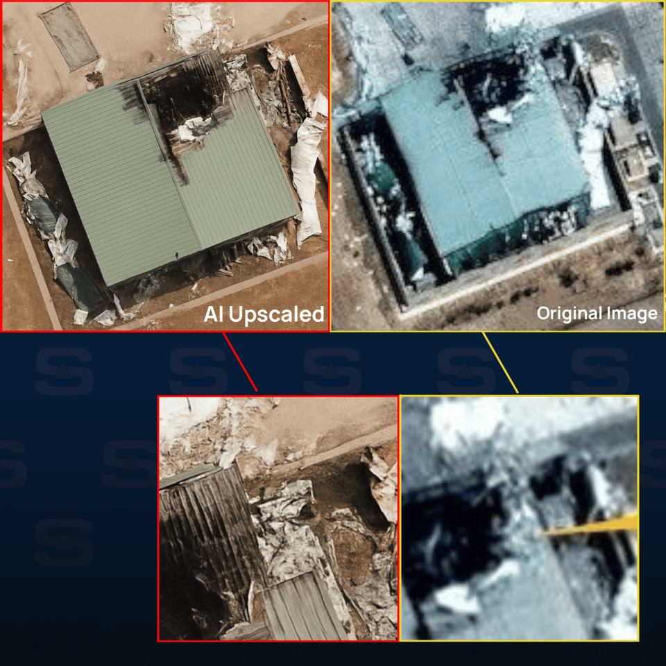
Here’s another example of how AI upscalers can distort the truth of an image. The damage shown here isn’t accurate. The roof details are incorrect, with one side appearing with vertical lines and the other horizontal. The overall image is far too crisp, smooth, and clean to be a real satellite shot. Can AI upscaling be helpful for getting a better view? Sometimes, yes, but it must be used very carefully and should never replace the original image.
Right now, the delivery of commercial satellite imagery over many parts of the Middle East has been paused by major providers such as Planet and Vantor. This gap creates what we call an information vacuum, where fakes can spread more easily, and even real, verified imagery can start to be questioned.
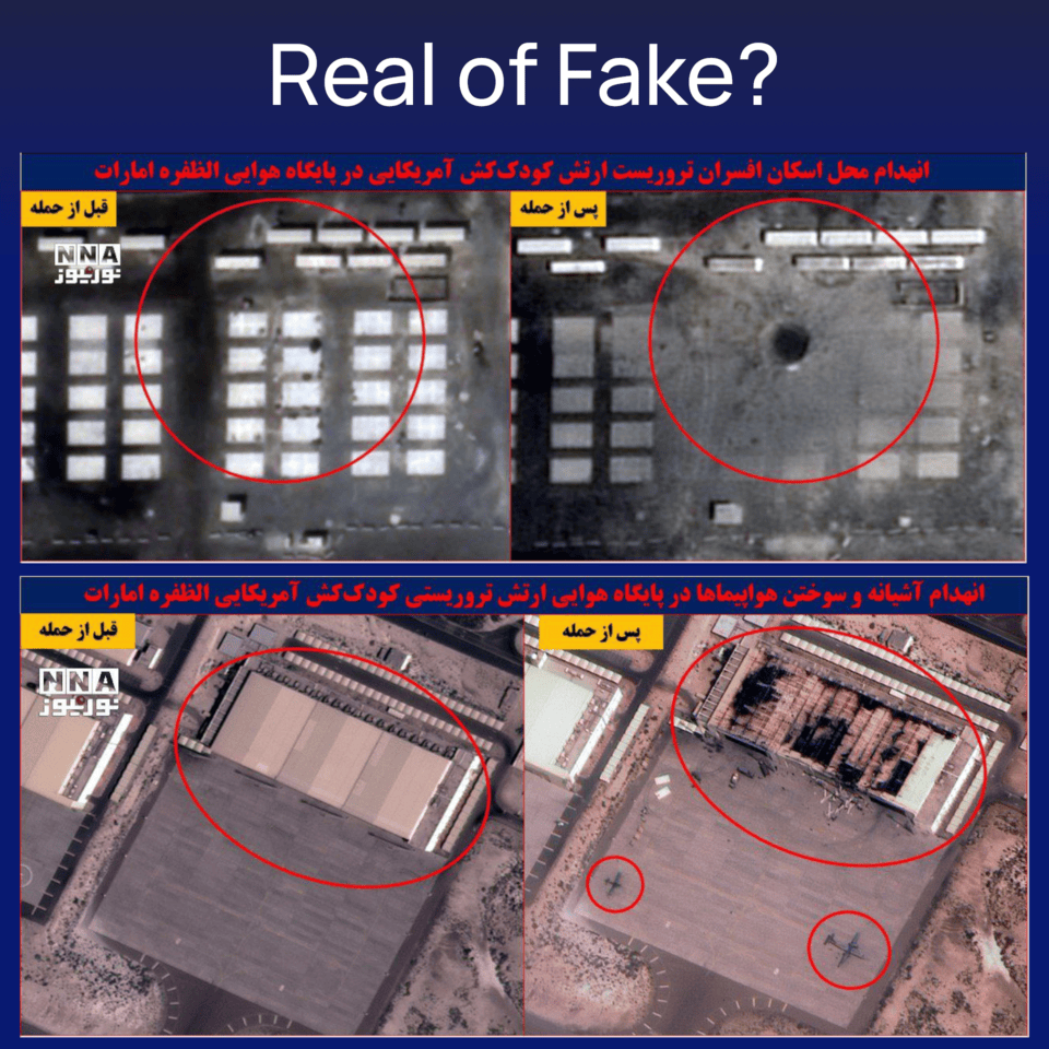
One example of this was imagery released by the Iranian press showing a large crater at an airbase. Many people believed the images were fake. We did something most can’t and independently verified the imagery by comparing real Airbus images over the same area to check for visible damage.

The satellite images were real! 😨 The same damage was clearly visible in our version. This just shows that even genuine imagery can be questioned or dismissed as fake, especially when access to reliable sources are limited.
Even with every precaution, it’s surprisingly easy to be misled by fake or distorted imagery. The internet has changed drastically over the past decade, and combating misinformation has never been more critical. 😅
Most people can’t task high-resolution satellites or spend hours tracking down original sources. It’s in that gap, between access and understanding, that false information spreads.
We hope Soar Atlas helps bridge that gap, providing a transparent space where imagery is contextualized, verified, and debated by the community. On Soar, everyone has free access to low-resolution Sentinel and Landsat imagery, which can be helpful to quickly check changes on the ground. On top of that, community reporting tools and a strict manual review process ensure every map uploaded is carefully vetted.
Next time you see a wild satellite image online, pause and ask yourself a simple question… is this real? 🤔